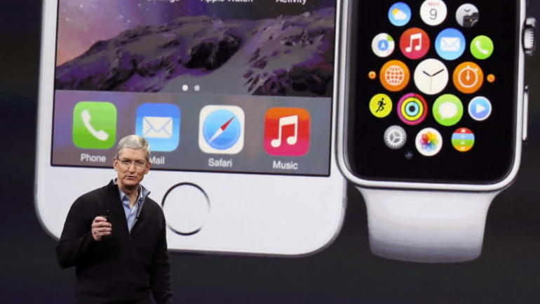
The long-awaited and highly anticipated Apple Watch was the darling of the tech giant’s latest opening of the kimono on Monday– but the most important question of all remains unclear.
In signature Apple fashion, the introduction of the device has not been terribly public, open, ‘beta,’ or seductive to developers, as was Google’s Glass. Rather, it’s remained tightly in Apple’s grip, no tactile teasing; all visual– videos, billboards, a few celebrities, and lots of pictures, pretty pictures.
Apple’s approach to the watch has been to build up as much buzz as possible: multiple announcements for the watch itself, simultaneous announcements around ApplePay, HealthKit, ResearchKit, and a number of other credibility-building tributaries to help users form a construct for ‘why would I need this?’ But the real question in everyone’s mind is: what will the thing be like to actually use??
Apple has remained surprisingly silent around usability
The coverage of the watch both in September and March has focused predominantly on the aesthetics of the hardware itself, the quality of the materials, not on how to use it, how to navigate the device– hardware or software. As the minutes ticked by during Monday’s event, we saw plenty of sexy close-ups of shiny metal edges, the clamp-on charger, the “crown”, and of course, all manner (and pricing) of wrist bands.
Indeed we’ve also been given a glimpse (or should we call it a Glance?) at a few curious use cases for the watch: the ability to share biometric data with medical research institutions, view notifications, scroll through Instagram, receive calls (Dick Tracy anyone?) even share your heartbeat with your partner. Yet, even as CEO, Tim Cook discussed these features, the demo took place on a large screen behind him, not through real-time demonstration driven by a human. The one exception to this was when Kevin Lynch demo’d the impressive opening of a garage door through the watch– but we were so distracted by the magic of Internet of Things in action, did we realize he wasn’t even wearing the watch?
Apple’s coverage of the Watch has indeed showcased utility, but it has not demonstrated useability. Ease of use (the ‘single’ button) has been a major selling point (and differentiator) for Apple’s iPhone and iPads. Although Apple compares the Watch to both, it’s brushed past this in the buzz-building around the Watch. Even in the demo, it remains a mystery is what the actual experience of using the device (yes, that includes actually wearing it) feels like.
Silence paves the way for consumers to make up their own minds
One theory for Apple’s omissions around how to use the thing is that they are saving themselves the potentially negative press that would emerge if it even looked difficult to use. Another is that Apple is carefully padding an already tempting urge we all have to try it for ourselves. Really, who doesn’t want to at least try it on? Apple is no doubt banking on this allure to at least drive foot traffic to its stores.
What Apple is saying may not help in the long-run
Given this slow roll-out/build-up, Apple has placed itself as the arbiters of our expectations. What is interesting is that Apple is absolutely banking on its laurels to drive interest: coining the watch as an extension of the iPhone. We saw this approach with the launch of the iPad in 2010– but is this the best strategy when scaling down in size?
“Anything you can do on your iPhone, you can now do you on the Watch.” –Tim Cook, CEO of Apple
While this is an intriguing concept, what Apple is doing is providing a point of reference for something that may fare better with a clean slate. They’re providing a point of reference (in a smartphone) that is perhaps incongruent: smartphones are bigger, they are literally pieces of technology we stuff in our pockets, they’re inconspicuous, ‘horizontal’ (as in you can use apps for just about anything). Wearables, particularly watches, are tiny compared to smartphones. They are inevitably fashion statements, worn on our wrists, (in a time when many people don’t even wear watches anymore, thanks to cell phones). The wearable market has succeeded with a more vertical approach– applied most effectively to one or a few use cases, typically related to health and fitness.
The big question: Do we consumers actually want a tiny smartphone on our wrists?
From a customer experience standpoint, the question we’re all asking ourselves, (especially thanks to Apple’s marketing and design strategy discussed above) is: do I actually want a smartphone on my wrist? Do we really want to be pinching, tapping, and zooming on an even smaller screen than a smartphone? Is voice recognition in a watch reliable enough to provide the comparably seamless experience we’re accustomed to on our smartphones?
A recent poll by Quartz found that 61% of existing US iPhone users are not at all likely to buy the Apple Watch.
And those are some of the most loyal fans around. Ouch.
What we can say about Apple Watch (1.0 anyway) is that it by no means frees us from the tethers of our smartphones. As consumers gain more glimpses into the Internet of Things, and what it can look like, customer experience, design, usability, and seamless and intuitive navigability are paramount.
Altimeter’s recent research on Customer Experience in the Internet of Things finds that when introducing connectivity to hitherto unconnected surfaces, companies must start with subtle tweaks, leverage existing templates for interaction. The question remains: Will using Apple Watch be more like interacting with a watch or a smartphone? Only time will tell.
—–
This post was originally posted on Altimeter Group’s blog and can be found here.


